Whether you've got stories to tell or art to create, there's a place for you here.

Scrum Masters
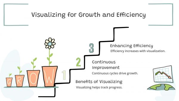
Visualizing Continuous Improvement Cycles

-
ARAnshu Raj- Founder & CEO, Drawify
-
Jan 05, 2026 5 min read
High-performing teams, agile organisations, and scalable strategies are all built on a foundation of continuous improvement. However, despite the wide acceptance of frameworks like PDCA, Kaizen, DMAIC, and Agile retrospectives, they are frequently overlooked, primarily due to complicated language or static spreadsheets.
This is where using Drawify to visualize cycles of continual development makes a discernible impact. Teams can monitor progress, identify gaps more quickly, and motivate action rather than confusion by converting abstract processes into clear, hand-drawn diagrams.
We'll look at how Drawify facilitates efficient communication, visualization, and optimization of continuous improvement cycles in this article.
Why Visualizing Continuous Improvement Matters:
Continuous improvement is a cycle rather than a one-time endeavour. However, when teams are unable to observe that loop clearly, a number of issues occur:
- Cycles of improvement seem repetitive rather than progressive.
- Members of the team don't know where they are in the process.
- Across documents, feedback and lessons are lost.
- Communicating progress to stakeholders is a challenge for leaders.
These problems are resolved by visuals, which enable improvement to be seen, discussed, and implemented.
Drawify transforms theoretical frameworks into dynamic visual systems that change according to your team's needs.

What Is Drawify:
Drawify is a visual diagramming tool designed to simplify complex ideas using hand-drawn style visuals, reusable components, and customizable templates. It’s especially effective for process-driven workflows like continuous improvement, where clarity and iteration matter most.
Drawify enables groups to:
- Make clear cycle diagrams.
- Make graphics unique for various teams or stages.
- Utilise resources for several projects.
- Clearly explain improvement journeys to any audience.
Visualizing Popular Continuous Improvement Models with Drawify:
1. PDCA Cycle (Plan–Do–Check–Act):
The PDCA cycle is foundational—but often reduced to a dull circular chart.
Using Drawify, you can:
- Design a clear, labelled loop with visual cues for each stage.
- Add icons, notes, or metrics to show real outcomes.
- Highlight where improvements stalled or succeeded.
As a result, PDCA feels more like a habit than a theory.
2. Kaizen Continuous Improvement Loops:
Kaizen thrives on small, consistent changes—but tracking them can be challenging.
With Drawify:
- Visualize incremental improvements over time.
- Show how small changes compound into big results.
- Create team-specific Kaizen boards using reusable visuals.
These visuals reinforce the mindset that every improvement counts.
3. Agile Retrospective Cycles:
Retrospectives are critical—but their insights often disappear after meetings.
Drawify helps teams:
- Map sprint feedback into visual loops.
- Connect “What worked” → “What didn’t” → “What we’ll try next”.
- Track recurring issues across sprints visually.
This turns retrospectives into continuous learning systems, not isolated discussions.
4. DMAIC for Process Optimization:
For Six Sigma and operational teams, DMAIC can feel complex to explain.
Using Drawify:
- Break down each phase visually.
- Show data flow and decision points clearly.
- Align cross-functional teams on improvement goals.
Visual DMAIC diagrams reduce resistance and increase adoption.
Benefits of Using Drawify for Continuous Improvement Visualization:
- Faster Understanding: Visual cycles are processed more quickly than text-heavy documentation.
- Better Team Alignment: Everyone sees the same improvement roadmap—no interpretation gaps.
- Stronger Engagement: Hand-drawn visuals feel approachable and collaborative, not corporate.
- Easy Iteration: Update diagrams as improvements evolve—no rebuilding from scratch.
- Clear Stakeholder Communication: Leaders can showcase progress and learning in a single visual.
Best Practices for Visualizing Improvement Cycles in Drawify:
- Keep cycles simple: Avoid overcrowding visuals.
- Use consistent symbols: Reinforce pattern recognition.
- Highlight feedback loops: Make learning visible.
- Version your visuals: Show evolution over time.
- Reuse templates: Maintain consistency across teams.
Who Can Benefit from Drawify Improvement Visuals:
- Product and engineering teams.
- Agile coaches and scrum masters.
- Operations and quality managers.
- Educators and trainers.
- Business leaders driving transformation.
If improvement is part of your workflow, visualization should be too.
Teams must be able to see, comprehend, and replicate the process for continuous improvement to be effective. Visuals can accomplish it, but text by itself cannot.
Through the use of Drawify to visualize continuous improvement cycles, organisations are able to convert abstract frameworks into systems that are obvious, collaborative, and actionable. Better decision-making, quicker learning, and long-term advancement are the outcomes.
It's time to literally draw your improvement cycles out if they seem stuck.
Post This Article to Your Socials
Popular Topics
- Events
- Workshops
- Visual Storytelling
- How to video
- Communities
- Sketchnoting
- Templates
- UX Designers
- Agile Professionals
- Product Managers
- Freelance Graphic Designers
- Creative Tech Enthusiasts
- Online Course Creators
- Social Media Content Creator
- Creative Agency Owners
- Marketing Professionals
- EdTech Professionals
- Scrum Masters
Similar Articles
Come, Be Part of Something Special
-
Got ideas that need visual superpowers?
Jump in and start creating presentations and communications that people actually remember.
Sign In -
Are you an artist ready to grow?
Join our Drawifier family and focus on what you love most - creating art that matters.
Become a Drawifier
Get visualisation tips every week
Subscribe to the Drawify Newsletter, and feed your creativity with visualisation tips and techniques, as well as the latest Drawify workshops, news and resources.
