Whether you've got stories to tell or art to create, there's a place for you here.

Product Managers
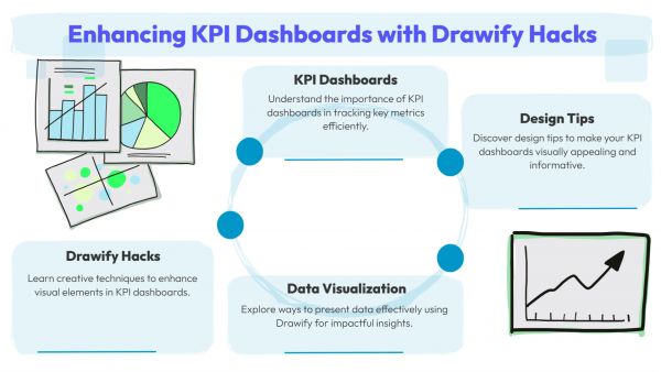
Drawify Hacks for KPI Dashboards

-
SDSwarnali Das- Co-founder, Chief Product Officer, Drawify
-
Jan 13, 2026 5 min read
Data tells a story—but only when people can actually understand it. KPI dashboards are supposed to help teams make decisions, yet so many end up doing the opposite: overwhelming everyone with numbers, charts, and clutter. The problem usually isn't the data itself. It's how it's presented.
That's where Drawify comes in. By applying visual-first thinking and simple illustrated elements, you can turn KPI dashboards into clear, actionable tools that people actually want to look at.
Why So Many Dashboards Miss the Mark:
Traditional dashboards often fall short because they try to show too much at once, lack any visual hierarchy, don't clearly highlight what matters, confuse people who aren't data experts, and focus more on displaying data than enabling decisions.
Drawify hacks are all about clarity over complexity.
What Are Drawify Hacks for Dashboards:
Think of them as simple visual techniques that help you highlight what matters most, guide people's attention to key metrics, show how different KPIs relate to each other, and add context without creating clutter.
You're not redesigning from scratch—you're enhancing how KPIs are seen and understood.

Practical Hacks to Make Your Dashboards Better:
- Group Related KPIs Visually: Use illustrated containers to group metrics that belong together—growth, engagement, revenue, performance. This cuts down on mental overload and makes dashboards easier to scan.
- Put Outcomes First: Arrange KPIs based on what actually matters. Primary metrics at the top, supporting ones below, context alongside. Drawify visuals help people know where to look first.
- Show Progress and Direction Clearly: Simple arrows, paths, or progress visuals can instantly communicate trends, whether things are growing or declining, and how you're tracking against targets. Insights become obvious at a glance.
Connect KPIs to Actions: Link metrics visually to what should happen next—what's working, what needs attention, what to optimize. Your dashboard becomes a guide for decisions, not just a report.
Tell a Story with Your Layout:
Instead of static grids, create a visual flow: current state, key insights, risks or blockers, next steps. This narrative approach makes it way easier for executives and stakeholders to get it.
Who Should Be Using This:
Product managers, marketing teams, business analysts, start-up founders, executives, leadership teams, operations managers, SaaS and growth teams—really, anyone who relies on dashboards to make decisions. If your team needs to understand data quickly, Drawify helps.
What You'll Actually Get:
Faster insight recognition. Clearer alignment across stakeholders. Less data overwhelm. More action-oriented conversations. Better confidence in decisions.
Dashboards shouldn't need a manual to understand.
A Few Best Practices:
Focus on 5–7 key KPIs maximum. Design for decision-making, not just reporting. Use consistent visual cues so people know what to look for. Keep illustrations simple and purposeful. And review regularly—good dashboards evolve as your goals change.
KPIs are only powerful when people actually understand them. With Drawify hacks, you're transforming raw metrics into visual stories that guide teams toward smarter, faster decisions.
When teams can see what matters, they act faster.
Stop just reporting data. Start illustrating insights with Drawify.
Post This Article to Your Socials
Popular Topics
- Events
- Workshops
- Visual Storytelling
- How to video
- Communities
- Sketchnoting
- Templates
- UX Designers
- Agile Professionals
- Product Managers
- Freelance Graphic Designers
- Creative Tech Enthusiasts
- Online Course Creators
- Social Media Content Creator
- Creative Agency Owners
- Marketing Professionals
- EdTech Professionals
- Scrum Masters
Similar Articles
Come, Be Part of Something Special
-
Got ideas that need visual superpowers?
Jump in and start creating presentations and communications that people actually remember.
Sign In -
Are you an artist ready to grow?
Join our Drawifier family and focus on what you love most - creating art that matters.
Become a Drawifier
Get visualisation tips every week
Subscribe to the Drawify Newsletter, and feed your creativity with visualisation tips and techniques, as well as the latest Drawify workshops, news and resources.
