Whether you've got stories to tell or art to create, there's a place for you here.

Online Course Creators
Turning Content into Visual Summaries

-
SDSwarnali Das- Co-founder, Chief Product Officer, Drawify
-
Nov 20, 2025 5 min read
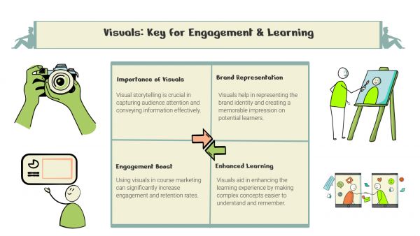
People in today's attention-driven society respond to visuals more quickly than words. For this reason, creating visual summaries of your written information is not just artistic but also strategic. Drawify makes it simple to transform text-heavy content into captivating and memorable visuals, whether you're summarizing blog articles, reports, or presentations.
Let's examine how using Drawify might enhance the clarity and originality of your summaries.
The Significance of Visual Summaries:
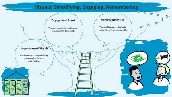
Using infographics, diagrams, or illustrated snapshots, a visual summary summarizes the most important information from your content into a brief visual storytelling. Your audience can quickly understand the key point rather of having to scroll through lengthy paragraphs.

Benefits of Visual Summaries Include:
- Faster Understanding: Visuals make complicated data easier to interpret.
- Better Retention: Visuals are much easier for people to recall than text.
- Increased Interaction: More clicks, shares, and saves are generated by visual posts.
- Improved Story Line: Visual highlights logical and emotional connections.
These advantages become available to everyone when combined with a program like Drawify; no prior design knowledge is required.
Using Drawify to Turn Content into Visual Summaries:
With the use of Drawify's ready-to-use illustrations, templates, and editable scenes, you can convert your written concepts into understandable visual formats. Here's how to best use it:
1. Identify the Core Objective:
Start by identifying the "must-remember" concepts - the most important insights or lessons from your content. Your visual summary will be built around these.
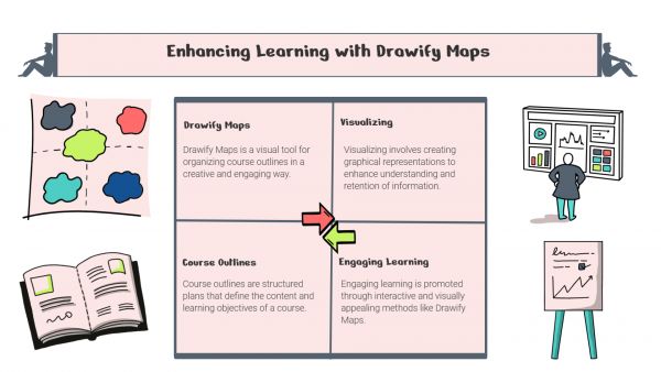
2. Select the Appropriate Visual Style:
From Drawify's library, choose an appropriate structure based on your content:
- Infographics for step-by-step guides or processes
- Diagrams for showing relationships or hierarchies
- Maps or timelines for visualizing journeys or events
- Visual cards for quick idea snapshots
3. Add Illustrations from Drawify’s Creator Library:
Use the hand-drawn illustrations provided by Drawify to convey your ideas. Colours, characters, icons, and layouts may all be customized to fit the aesthetic of your brand.
4. Make the Text Simpler:
Use as little text as possible to enhance the visuals. Consider headlines, brief statements, and important numbers rather than complete sentences. Making the summary readable and simple to understand is the aim.
5. Make Use of Consistent Visual Language:
Maintain consistency in icon styles, colour schemes, and typography. Drawify's theme-based illustration sets simplify this process and make sure your visual summary has a professional, consistent appearance.
Where to Use Visual Summaries:
Your visual summary will appear outstanding on a variety of platforms once they are created:
- Social Media Posts: Use visual storytelling to draw attention instantly.
- Blog Recaps: Use visuals to break up lengthy pieces.
- Presentations: Use powerful images in place of wordy slides.
- Email Newsletters: Provide a graphic summary of updates so that readers may quickly understand them.
- Reports on Whitepapers: Infographics can be used to illustrate important findings in reports or whitepapers.
You may transform static content into an engaging visual experience by carefully using Drawify visuals.
Drawify: An Easy Way to Think Visually:
Anyone can easily visualize their content with Drawify, including educators, marketers, entrepreneurs, and innovators. To produce visuals of a professional quality, all you need is the appropriate tool and a clear message.
The community of illustrators on Drawify assures that you will always find visuals that fit your tone, whether it is data-driven, professional, or playful.
To conclude, creating visual summaries of content is an improvement in communication rather than just a design task. Long-form concepts can be transformed into visuals with Drawify that have a greater impact, spread more quickly, and stick around longer.
Therefore, the next time you publish a report, blog article, or presentation, use Drawify to illustrate it rather than merely sharing facts.
Post This Article to Your Socials
Popular Topics
- Events
- Workshops
- Visual Storytelling
- How to video
- Communities
- Sketchnoting
- Templates
- UX Designers
- Agile Professionals
- Product Managers
- Freelance Graphic Designers
- Creative Tech Enthusiasts
- Online Course Creators
- Social Media Content Creator
- Creative Agency Owners
- Marketing Professionals
- EdTech Professionals
- Scrum Masters
Similar Articles
Come, Be Part of Something Special
-
Got ideas that need visual superpowers?
Jump in and start creating presentations and communications that people actually remember.
Sign In -
Are you an artist ready to grow?
Join our Drawifier family and focus on what you love most - creating art that matters.
Become a Drawifier
Get visualisation tips every week
Subscribe to the Drawify Newsletter, and feed your creativity with visualisation tips and techniques, as well as the latest Drawify workshops, news and resources.
