Whether you've got stories to tell or art to create, there's a place for you here.

Product Managers
Illustrating User Feedback Loops
-
ARAnshu Raj- Founder & CEO, Drawify
-
Sep 29, 2025 5 min read
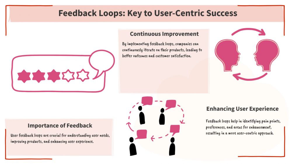
User feedback loops are the backbone of successful product development and customer experience optimisation. When properly visualised, these loops become powerful tools for understanding customer behaviour, identifying improvement opportunities, and creating more engaging user experiences. Drawify, a leading visual communication platform, offers exceptional capabilities for illustrating user feedback loops that drive meaningful business outcomes.
What Are User Feedback Loops:
The continuous process of gathering, evaluating, and applying user feedback to enhance goods, services, or experiences is known as a user feedback loop. These loops establish a dynamic relationship between companies and their clients, where user insights have a direct impact on plans for improving and evolving products.
The typical user feedback loop consists of four essential stages: data collection, analysis and interpretation, implementation of changes, and measurement of results. This cyclical process ensures that businesses remain responsive to user needs while continuously refining their offerings based on real-world usage patterns and customer preferences.

Why Visual Representation Matters for Feedback Loops:
Visual representation transforms complex feedback processes into easily understandable diagrams that stakeholders across all organisational levels can comprehend. When feedback loops are illustrated effectively, teams can identify bottlenecks, gaps, and optimisation opportunities that might otherwise remain hidden in textual documentation or spreadsheet data.
Drawify excels at creating these visual representations because it combines intuitive design tools with collaborative features that enable teams to work together on feedback loop documentation. The platform's extensive library of templates, icons, and design elements makes it simple to create professional-quality diagrams that accurately represent even the most complex feedback processes.
Key Components of Effective Feedback Loop Illustrations:
· User Input Collection Points: Every effective feedback loop illustration must clearly identify where and how user input is collected. These touchpoints might include surveys, support tickets, product reviews, social media interactions, user interviews, analytics data, and behavioural tracking systems. Drawify's flexible canvas allows designers to create distinct visual representations for each input source, making it easy to understand the comprehensive nature of feedback collection efforts.
· Data Processing and Analysis Workflows: The analysis phase represents where raw feedback transforms into actionable insights. Effective illustrations show how different types of feedback flow through various analytical processes, from simple categorisation systems to complex sentiment analysis and trend identification procedures. Drawify's flowchart and process diagram capabilities enable teams to map these analytical workflows with precision and clarity.
· Decision-Making Pathways: User feedback loops must illustrate how insights translate into concrete decisions and actions. This includes showing approval processes, prioritisation frameworks, resource allocation decisions, and implementation timelines. Drawify's organisational chart and decision tree features help teams visualise these critical pathways clearly and comprehensively.
· Implementation and Deployment Processes: The implementation phase shows how decisions become reality through development cycles, testing procedures, and deployment strategies. Effective illustrations demonstrate the connection between user feedback and actual product changes, helping stakeholders understand the tangible impact of the feedback loop process.
Best Practices for Creating Feedback Loop Diagrams with Drawify:
· Start with Clear Objectives: Before creating any feedback loop illustration, define what specific aspects of the process you want to communicate. Are you focusing on the overall loop structure, highlighting specific bottlenecks, or demonstrating the impact of recent improvements? Clear objectives guide design decisions and ensure your illustration effectively serves its intended purpose.
Drawify's template library includes pre-designed feedback loop frameworks that can serve as starting points for your specific requirements. These templates provide professional structure while allowing for customisation based on your unique organisational needs and processes.
· Use Consistent Visual Language: Maintain consistent colours, shapes, and symbols throughout your feedback loop illustrations to create professional, easy-to-follow diagrams. Establish a visual legend that defines what different elements represent, ensuring that anyone viewing your diagram can understand its components without additional explanation.
Drawify's style guide features help maintain visual consistency across multiple diagrams and team members. The platform's collaborative tools ensure that all team members can access and apply consistent styling standards, regardless of who creates or modifies specific illustrations.
Incorporate Data and Metrics: Effective feedback loop illustrations go beyond showing process flow by incorporating relevant metrics and performance indicators. Include data points such as response rates, processing times, implementation success rates, and user satisfaction improvements to demonstrate the quantifiable impact of your feedback processes.
Drawify's integration capabilities allow teams to connect their diagrams with live data sources, creating dynamic illustrations that automatically update as metrics change. This feature ensures that feedback loop documentation remains current and accurately reflects real-world performance.
Advanced Techniques for Feedback Loop Visualisation:
· Multi-Channel Integration Mapping: Modern businesses collect user feedback through numerous channels, from traditional surveys to social media monitoring and behavioural analytics. Advanced feedback loop illustrations show how these diverse input streams integrate into cohesive analytical frameworks that provide comprehensive user insights.
Drawify's advanced diagramming features enable the creation of complex, multi-layered illustrations that show channel integration without overwhelming viewers with unnecessary complexity. The platform's zoom and layer functionality allow users to explore different levels of detail as needed.
· Temporal Flow Representation: User feedback loops operate across different time scales, from immediate response systems to long-term trend analysis and strategic planning cycles. Effective illustrations show these temporal relationships, helping stakeholders understand both immediate and long-term aspects of feedback processing.
Timeline and Gantt chart features in Drawify enable teams to create time-aware feedback loop illustrations that show how different processes unfold over various time periods. These temporal representations help organisations coordinate feedback activities with broader business planning cycles.
· Stakeholder Impact Visualisation: Comprehensive feedback loop illustrations show how different organisational stakeholders participate in and benefit from feedback processes. From customer service representatives who collect initial feedback to executives who make strategic decisions based on analytical insights, effective diagrams map stakeholder involvement throughout the entire loop.
Drawify's organisational and stakeholder mapping tools facilitate the creation of illustrations that clearly show roles, responsibilities, and interdependencies within feedback loop processes. These visualisations help ensure that all relevant parties understand their contributions to successful feedback management.
Measuring the Success of Your Feedback Loop Illustrations:
· Clarity and Comprehension Metrics: The effectiveness of feedback loop illustrations can be measured through stakeholder comprehension assessments, training efficiency improvements, and reduced clarification requests. When team members can quickly understand and act upon feedback processes through visual documentation, the illustrations are serving their intended purpose effectively.
· Process Improvement Identification: Effective feedback loop illustrations frequently highlight areas for optimisation that were not evident in written documentation. Keep track of the frequency with which your visual documentation results in efforts for workflow optimisation, bottleneck discovery, or process enhancements.
· Collaboration Enhancement: Effective feedback loop illustrations should facilitate better collaboration among team members working on different aspects of the feedback process. Monitor how visual documentation impacts cross-functional communication, project coordination, and stakeholder alignment.
Future Trends in Feedback Loop Visualisation:
The evolution of user feedback collection and analysis continues to accelerate, with artificial intelligence, machine learning, and automated analysis tools transforming how organisations process and act upon user insights. Modern feedback loop illustrations must account for these technological advances while remaining accessible to stakeholders across various technical backgrounds.
Drawify's platform evolution includes features designed to accommodate these emerging trends, from AI-assisted diagram creation to automated data integration and dynamic visualisation updates. These capabilities ensure that feedback loop illustrations remain relevant and useful as business processes continue to evolve.
Illustrating user feedback loops with Drawify transforms complex processes into clear, actionable visual documentation that drives organisational success. By combining Drawify's powerful design capabilities with best practices for feedback loop visualisation, teams can create compelling diagrams that facilitate understanding, collaboration, and continuous improvement.
The investment in a quality feedback loop illustration pays dividends through improved stakeholder alignment, more efficient process execution, and enhanced ability to identify and capitalise on improvement opportunities. As businesses continue to prioritise customer-centric approaches, the ability to effectively visualise and communicate feedback processes becomes increasingly valuable for sustained competitive advantage.
Whether you're documenting existing feedback processes, designing new collection and analysis workflows, or communicating improvement initiatives to stakeholders, Drawify provides the tools and flexibility needed to create professional, effective feedback loop illustrations that drive meaningful business outcomes.
Post This Article to Your Socials
Popular Topics
- Events
- Workshops
- Visual Storytelling
- How to video
- Communities
- Sketchnoting
- Templates
- UX Designers
- Agile Professionals
- Product Managers
- Freelance Graphic Designers
- Creative Tech Enthusiasts
- Online Course Creators
- Social Media Content Creator
- Creative Agency Owners
- Marketing Professionals
- EdTech Professionals
- Scrum Masters
Similar Articles
Come, Be Part of Something Special
-
Got ideas that need visual superpowers?
Jump in and start creating presentations and communications that people actually remember.
Sign In -
Are you an artist ready to grow?
Join our Drawifier family and focus on what you love most - creating art that matters.
Become a Drawifier
Get visualisation tips every week
Subscribe to the Drawify Newsletter, and feed your creativity with visualisation tips and techniques, as well as the latest Drawify workshops, news and resources.
