Whether you've got stories to tell or art to create, there's a place for you here.

Marketing Professionals
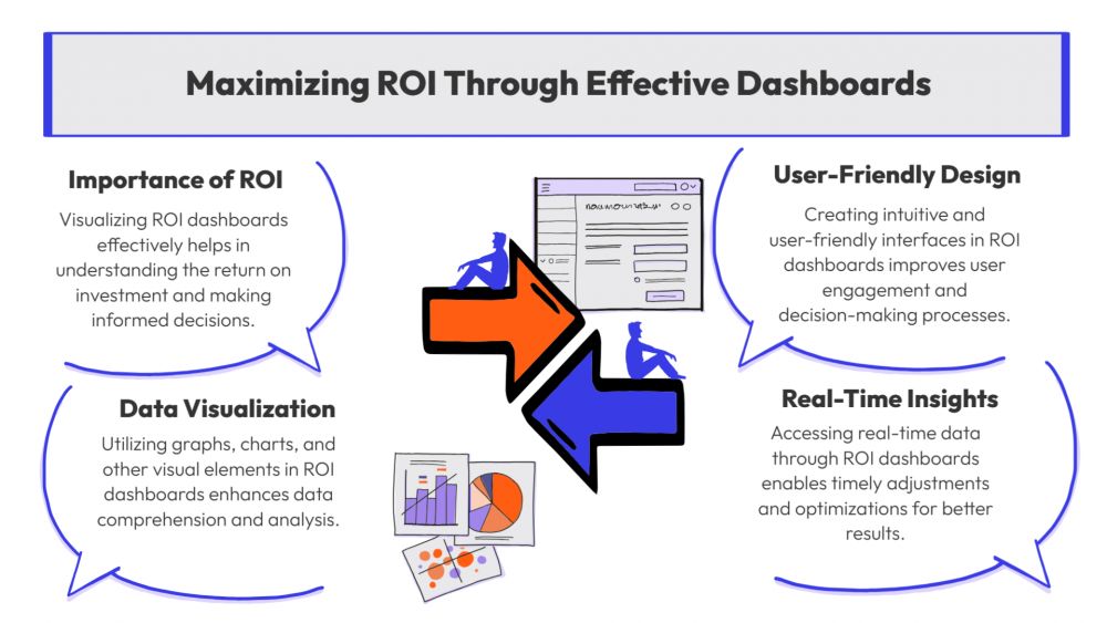
Visualizing ROI Dashboards Effectively
-
SDSwarnali Das- Co-founder, Chief Product Officer, Drawify
-
Nov 15, 2025 5 min read
In the fast-paced fields of project management, sales, and marketing, performance evaluation is essential. However, Return on Investment (ROI) dashboards are sometimes overcrowded with complex visuals that don't make sense. Drawify, a visual storytelling tool that turns complex data into captivating, understandable dashboards that inspire insight and action, can help with that.
The Significance of ROI Dashboards:
Teams and decision-makers may quickly evaluate how well resources are being used with the help of an ROI dashboard. An ROI dashboard is useful for tracking marketing efforts, sales conversions, and operational effectiveness.
- Measure the things that are and are not working.
- Compare results across projects or time periods.
- Encourage data-driven choices with clear visuals.
However, those insights are lost if the data is presented in a misleading way. Visualization is therefore very important.
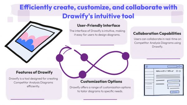
Using Drawify to Transform ROI Metrics into Visual Narratives:
Drawify makes it possible for anyone, even non-designers, to produce expert visuals that make complexity easier to understand. You can create dashboards that instantly convey value by using Drawify's visual templates, icons, and layouts rather than staring at rows of numbers or generic bar graphs.
1. Start with a Clear Visual Framework:
Make use of Drawify templates that correspond with your reporting objectives. Select layouts intended for financial analytics, funnel performance, or KPI comparisons, for instance. Important figures, like as sales growth or cost per acquisition, are made to stand out by the visual hierarchy.
2. Make Strategic Use of Colours and Icons:
Icons, colour-coded results, and directional arrows are examples of visual cues that can be used to highlight performance trends. For example, viewers can quickly understand the data story by using red indicators for deteriorating performance or green arrows for growth.
3. Use Contextual Visuals to Improve Storytelling:
You can give your ROI reports an emotional depth by using Drawify's graphics. You can use contextual graphics, such as an expanding network to highlight client acquisition or a growing plant to display profit development, in place of just a pie chart. These visuals establish a sentimental bond with your data.
4. Make Things Simpler for Clarity:
Drawify encourages a simple graphic style. You can keep focus on what is really important by combining explanatory visuals with important data representations rather than creating spreadsheets. This improves understanding and prepares your ROI reports for presentation.
5. Work Together and Customize:
Teams may co-create ROI visualizations using Drawify's collaborative capabilities, which assure that everyone offers their viewpoint. You may customize each dashboard to showcase the most significant KPIs, regardless of whether you're creating it for clients, executives, or investors.
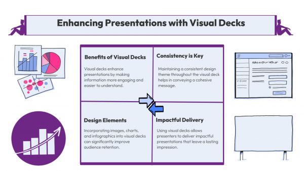
Benefits of Visual ROI Dashboards Using Drawify:
- Improved Understanding: Visuals help people understand difficult metrics.
- Faster Decision-Making: Teams can respond easily to insights because of clear visuals.
- Better Engagement: Compared to plain data, illustrated dashboards retain more attention.
- Brand Consistency: Modify visuals to match the colour palette and tone of your business.
Practical Use Cases:
- Campaign ROI and ad performance are visualized by marketing teams.
- Sales departments monitor transaction conversion rates and revenue development.
- Teams in charge of finance compare quarterly performance indicators.
- Start-ups and agencies that produce visual pitch materials or investment reports.
Visual storytelling is an emerging form of business intelligence in an era where data is growing and attention spans are getting shorter. You can transform standard ROI dashboards into effective visual tools that motivate action in addition to providing information by using Drawify.
Discover how Drawify can transform your ROI reporting from data-heavy to insight-driven, and start visualising more intelligently now!
Post This Article to Your Socials
Popular Topics
- Events
- Workshops
- Visual Storytelling
- How to video
- Communities
- Sketchnoting
- Templates
- UX Designers
- Agile Professionals
- Product Managers
- Freelance Graphic Designers
- Creative Tech Enthusiasts
- Online Course Creators
- Social Media Content Creator
- Creative Agency Owners
- Marketing Professionals
- EdTech Professionals
- Scrum Masters
Similar Articles
Come, Be Part of Something Special
-
Got ideas that need visual superpowers?
Jump in and start creating presentations and communications that people actually remember.
Sign In -
Are you an artist ready to grow?
Join our Drawifier family and focus on what you love most - creating art that matters.
Become a Drawifier
Get visualisation tips every week
Subscribe to the Drawify Newsletter, and feed your creativity with visualisation tips and techniques, as well as the latest Drawify workshops, news and resources.
