Whether you've got stories to tell or art to create, there's a place for you here.

Marketing Professionals
Turning Insights into Report Graphics
-
ARAnshu Raj- Founder & CEO, Drawify
-
Nov 13, 2025 5 min read
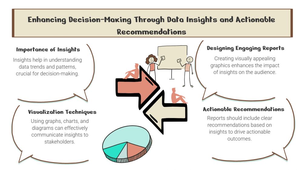
Data and insights have enormous potential, but only if they are properly articulated. Reports featuring a lot of text and figures may overwhelm readers, making it challenging to emphasize important lessons. This is where visual storytelling is useful. You can easily transform unprocessed findings into captivating report graphics using Drawify, captivating audiences, and instantly simplifying difficult material.
The Significance of Visual Reports:
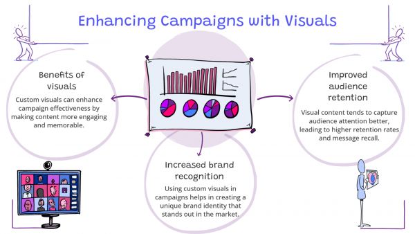
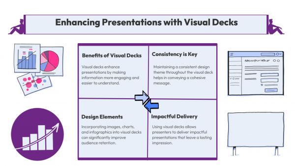
Contemporary professionals seek clarity instead of using only statistics. By converting analytics, survey data, or performance measurements into simple visuals, graphic representations facilitate the assimilation of information. Charts, timelines, and illustrated summaries allow stakeholders to quickly understand the meaning of the numbers without going through countless paragraphs or spreadsheets.
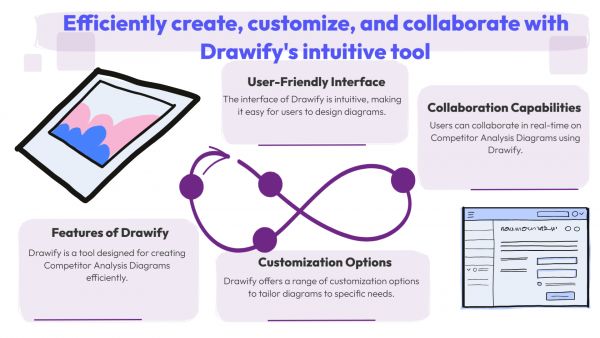
Drawify: Your Visual Report Partner:
Drawify streamlines the process of producing attractive report visuals. With its extensive collection of hand-drawn illustrations, editable templates, and simple drag-and-drop interface, anyone, from analysts to marketers, can create skilled visualizations without the requirement for graphic design knowledge.
Drawify can change your reporting process in the following ways:
1. Visualize Key Metrics Clearly:
Transform unprocessed data into infographics, charts, and icons that showcase performance trends and results. Whether it's quarterly revenue, campaign engagement, or customer feedback, Drawify's pre-made graphics enable you to highlight what really counts.
2. Summarize Insights with Storytelling:
Reports that are stories in nature are easier to retain. Using illustrated personas, progress arrows, or visual metaphors, Drawify enables you to combine visuals with storytelling flow, transforming abstract insights into captivating stories.
3. Customize for Brand Consistency:
With Drawify's simple customization options, you can maintain your reports' brand. Make sure every report has a consistent, professional look by adjusting the colours, typography, and layout to match your company's visual brand.
4. Accelerate Reporting Processes:
There is no need to start from scratch anymore. Drawify's dashboard, performance evaluation, and strategy report templates save you hours of exhausting manual design effort. Drawify will take care of the visuals, so that you can concentrate on the observations.
5. Engage Stakeholders Effectively:
People pay attention when the news is visually appealing. Make reports that motivate teams, impress clients, and improve decision-making by utilizing Drawify visuals.
Practical Use Cases:
- Marketing Reports: Create visually appealing infographics using campaign analytics.
- Sales Dashboards: See monthly goals and comparisons of success.
- HR Reports: Show training advancements, diversity, and employee engagement.
- Research Summaries: Make data-intensive studies easier to understand by using visuals.
Pro Tips for Effective Report Graphics
- Simplify your visuals by emphasizing just one insight per visual.
- Strategically use colour to highlight patterns or results.
- For clarity, combine data graphics with short explanations.
Keep the layout and appearance of your icons consistent throughout all of your presentations or pages.
To conclude, designing report graphics from insights doesn't have to be a difficult design task. Drawify enables you to produce visualizations that make your data come to life, assisting stakeholders, teams, and clients in understanding the meaning underlying the statistics. The Result? Reports that inspire, educate, and have an impact are the end result.
Post This Article to Your Socials
Popular Topics
- Events
- Workshops
- Visual Storytelling
- How to video
- Communities
- Sketchnoting
- Templates
- UX Designers
- Agile Professionals
- Product Managers
- Freelance Graphic Designers
- Creative Tech Enthusiasts
- Online Course Creators
- Social Media Content Creator
- Creative Agency Owners
- Marketing Professionals
- EdTech Professionals
- Scrum Masters
Similar Articles
Come, Be Part of Something Special
-
Got ideas that need visual superpowers?
Jump in and start creating presentations and communications that people actually remember.
Sign In -
Are you an artist ready to grow?
Join our Drawifier family and focus on what you love most - creating art that matters.
Become a Drawifier
Get visualisation tips every week
Subscribe to the Drawify Newsletter, and feed your creativity with visualisation tips and techniques, as well as the latest Drawify workshops, news and resources.
